Pages

Pages

Thursday, 25 February 2016

Personal Response - Jiang Zhi

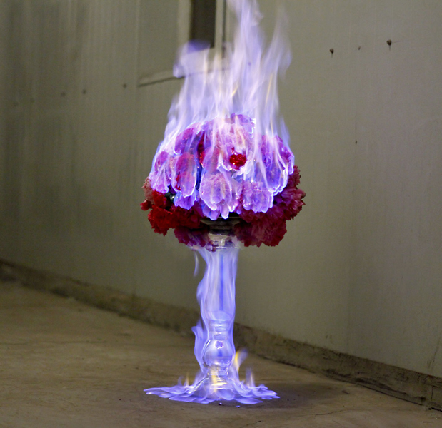
When taking photos as a personal response, I decided to take photographs of burning old or personal items as a way of symbolising how we can burn and destroy the past but the reality is that the memories will still remain. I then chose to take photographs at a slower shutter speed of 1/125 to make the flames look like they were flowing more as opposed to a faster shutter speed which would make them look more solid and still.


After importing one of my images into photoshop, I chose to change the levels in order to make the darker elements even darker, bringing our the brighter elements of the flames and making them bolder so they catch the eye.


My next step was to adjust the brightness and the contrast. Once again, this allowed me to make the flames bolder and eye catching as well as making the contrast of colours more evident within the image. 


I then proceeded to change the hue, saturation and lightness. As you can see, this gave the flames a warmer tint and made them seem more red-pink and orange. This also highlighted some of the darker tones and emphasised the glow of the flames on the ash and rubble which makes the image more aesthetically pleasing. Changing the lightness also changed the black so that it was a little lighter, giving almost a vintage feel. 


The final step I took was to change the highlight and shadow within the composition. This gave the flames more form and contrast as well as highlighting more of the darker tones that are slightly lighter than the black. I feel that this has made the image seem much more aesthetically pleasing and interesting to look at.


Final Images:


Contact Sheets:


Thursday, 11 February 2016

Jiang Zhi

Jiang Zhi is an Asian, contemporary photographer and considered to be one of China's most diverse and avant garde artists of his age. Over the years, he has had many different exhibitions and portfolios but the one I find most interesting is his work Love Letters. 

Love Letters is a series of photographs taken by Zhi in which he sets fire to flowers and captures the images of the flames engulfing them. The silky, ethereal quality of the flames has been created by a slower shutter speed with the camera placed on a tripod in order to keep the flowers crisp and clear which contrasts with the floating quality of the fire. Some of the images have been placed against a black background to bring out the colours of the flames and petals whereas others are in different locations with brighter coloured flames that contrast with the more dull and dim colours and tones of the environment in which the photographs have been taken.


Zhi has used low key lighting to bring out the full colours of the flames against the backgrounds chosen, creating a sort of fantasy or dreamlike within the compositions. This makes them more aesthetically appealing as opposed to using brighter lighting which would wash out the images and make them less successful as images. The colours seem to m,ix and mingle in certain places whilst also keeping the shape and form of the flowers which makes them look more interesting and unique. The colours of the flames also contrast with the colours of the petals as well as the backgrounds which draws attention to the subject matter.

The subject matter in these photos in particular has been placed in the centre of the composition which naturally draws the eye to the middle of the image. This is more successful on the images with the black backgrounds as there is nothing else within the image to detract attention from the subject matter, allowing us to pay more attention to the way the fire flows or the different colours that highlight the shapes of the flower petals.

Monday, 8 February 2016

Antonio Mora

Spanish artist Antonio Mora creates intriguing and surreal images by combining portraits and landscapes. The way he does this makes some of his artwork seem almost dreamlike and create an air of ethereality and fantasy. Not only this, but his images can also seem more dramatic and bold due to the subject matter of the photographs he uses. The compositions are intriguing and very aesthetically pleasing with the fusioned images complimenting each other to make stunning compositional pieces. 


The achromatic image draws in the eye and catches the attention of the viewer. The grey and black wisps and markings blend in seamlessly with the lower half of the subject's face which creates an image that intrigues the audience and creates an emotive response of thoughtfulness and wonder. The dark skin of the model contrasts with the white background and the subject matter is central which draws more attention to the centre of the image itself. 

The monochromatic image of the male model and the reeds in the river is just as effective as the prior composition. The images fade into each other and create an image that subtly holds the attention of the viewer. The lighting is softer with a clearer use of aperture, the darker tones standing out more against the light and mid-tones. The model is central within the composition which draws in the viewer. There is also a clear use of the rue of thirds; the landscape starting in the top third, transition in the middle, and then the lower half of the models face in the bottom third. 

Wednesday, 3 February 2016

Erwin Blumenfeld


Erwin Blumenfeld, a German artist and photographer, is considered to be one of the most influential photographers of the 20th century. He created a wide range of photographs throughout his thirty five year career span which included black and white portraits and nudes, celebrity portraiture, advertising campaigns and fashion photography. He employed fine art in his photography works as well as being a portraitist. He worked for Bazaar for three years after he was imprisoned in Vézelay and then as a freelancer for Vogue. His work was published on the cover of Vogue for the next 15 years as well as being featured in other magazines such as Life, Flair, and Look.

His fashion work was usually shot in colour while his work on other subjects were more monochrome. He used a variety of photography techniques such as double exposure, sandwich printing, solarisation, veils and mirrors. His work has an aesthetic quality that draws in the eye of the viewer, both with colour and monochrome. In the coloured image, we see a clear contrast between the warm red, the neutral white, and the cool blue. The colour is more saturated to grab attention and contrasts vibrantly with the black background. This creates more of an outlined quality with the low-key lighting and defined shapes of the brighter tones within the composition.

In the monochromatic image to the right, the first thing we are drawn to is the black and white outline of the model in the background which is positioned within close proximity of the model herself. The solid black shapes contrast with the more grey-ish tones of the model. This clear contrast of tone makes the composition more intriguing and interesting to look at as it looks like a mix of digital and analogue images, something that we wouldn't have had back in the time period this photo was created. The combination would have been more exciting and unusual back when the image was first created as it would seem more unique due to the fact that there was no technology like what we have today in order to create such bold shapes.